Bias: Impact on the Designer
Whether explicit or implicit, the effects of bias are prevalent even among designs. Through a class discussion, we were told to create seven circles, or "lenses," to help us identify our own personal biases.
Very early on in the activity, I noticed a trend within my lenses. I am a female, only-child with a single mother— my life reflects an implicit bias towards men. This was something that I never thought would pose a potential issue in my designs. Upon further thought, I realized that so far in my (limited) career as a designer, I have primarily focused on a target audience of women.
In all my communication courses we are told to ensure that we have a specific target audience, but at what point are we too focused? Is it better to serve a broader audience or continue with a niche group of people?
I think in terms of design and creation of content the target audience differs on a project to project basis, but it is crucial that as a designer you have a diverse portfolio of varying target audiences.
As we as a society move further away from gender norms, the roles of marketers and designers alike are changing. We must now strategize new ways to market products while making sure we prevent an implicit bias in our products.
Our class discussion was also guided by the reading of Jen Heazlewood's, "Combatting unconscious bias in design." Something that stood out to me in the article is that 11% of creative directors are female while 73% of consumer purchasing decisions are made by females. So not only is bias apparent in designs themselves but in the industry as well. It's almost poetic irony that graphic designers are being tasked with making their designs more inclusive while there is such an apparent bias in hiring creative teams.
It's important to note that this issue is larger than any one designer, company, etc.. In order to decrease the prevalence of implicit bias in designs there needs to be a greater push for social justice and equality. If we continue to discriminate and allow bias of any kind to infiltrate the way we establish our society, there is no way to create a universally inclusive design standard.
Moving forward, I plan to make a more conscious effort in taking account of my own biases within my designs. I will continue to edit and redesign solutions to ensure they are as diverse and inclusive as they can be. Especially in this time following the 2020 presidential election, I will further advocate for other designers to do the same while also trying to be a stronger advocate for equality on a national scale. As a nation by the people and for the people, it is evident that the power is in the hands of those who choose to participate in our democracy, and it is our job as designers to represent the voices of all people needing to be heard.
Gill Sans: Versatility and History
"... An alphabet should be as near as possible ‘fool-proof’… as the philosophers would say—nothing should be left to the imagination of the sign-writer or enamel-plate maker," said Eric Gill, creator of Gill Sans, in his 1931 "Essay on Typography."
As was the hope of Eric Gill, the appeal of Gill Sans lies within the letterform— high contrast and high legibility from a distance. Together these elements create a unilateral sense of clarity.
Gill Sans was based off of Edward Johnston's famous typeface, Johnston Sans which was created for the London Underground in 1913. Johnston's apprentice, Eric Gill, then set out to adapt the typeface in 1926 and later completed it in 1928. Gill Sans is widely used and was the official font for the LNER railway system. In 1948, the British Railways decided to use the typeface for all of its print media. Additionally, the BBC has utilized Gill Sans for its corporate typeface since 1997. Then in 2000, the Church of England adopted use of the typeface for its series "Common Worship." Although Gill Sans is most commonly associated with Britain, the typeface is well-known and universally used.
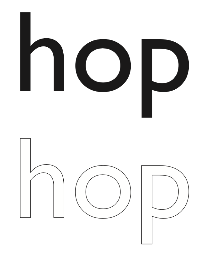
Gill Sans is a humanist sans serif font with roman characters. You can identify the font as humanist through the curvature of the "h" as it transitions from a thin to thick stroke as it moves to the shoulder. This stroke is used to emulate classical calligraphy. The roman characters are evident through the standard, upright form of the typeface. Additionally, the typeface is high contrast as it is opaque and visible from far distances. The primary use of broad strokes creates a feeling of tranquility as the reader knows what to expect.
Something very visually interesting that stands out immediately to me is the curve of the against the baseline of the "p" while the counter of the "o" is perfectly symmetrical. The counter in the "p" is also visually interesting as it's not completely proportional. The ascender and descender in "h" and "p" respectively appear to be the same length and width which is emphatic of the clarity that Gill was trying to accomplish.
Gill Sans conveys a professional attitude as the distinct clarity of the letterforms parallel the clarity that characterizes professional work. With the formality associated with the use of the font, the tone of Gill Sans is very confident. The typeface embodies professionalism as it is precise and efficient. Because of its structurally sound composure, Gill Sans versatility works well in combination with a number of fonts. Some examples of font pairings that I think work especially well are: Futura, Adobe Caslon, and Garamond. These examples are effective in showcasing the sophistication of the typeface.
Typographic Contrast: 7 Basic Principles Creating Infinite Results
When it comes to designing with text, the most critical aspect of any form of typography is the principle of contrast. The great Carl Dair came up with seven types of typographic contrast: size, weight, form, structure, texture, color, and direction.
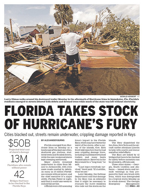
In the "Florida Takes Stock of Hurricane's Fury" image, the primary example of contrast used is the principle of size. Through the differentiation of size, the reader knows the hierarchy of how they should read the page. The weight of the words in the headline is significantly heavier than the rest of the page which builds interest around the headline. This example also has a slight use of the principle of color with the gray captions under the statistics. Through use of these three principles, they guide the reader's eye to tell them where they should go next.
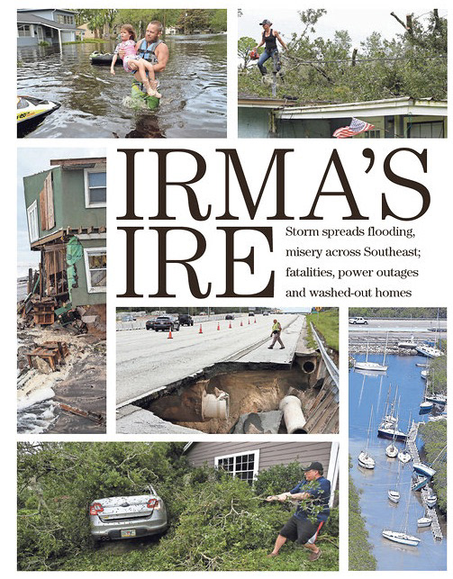
In the "Irma's Ire" image, there are only a few examples of typographic contrast. The most obvious being size as the title "Irma's Ire" takes up the most space and immediately draws the reader's attention. The next principle used is weight as there is a slight variation between the weight of the title, and the weight of the subheading. Through variance of size and weight, the example is more visually interesting.
Both examples showcase how contrast can be accomplished while only using a handful of principles. "Irma's Ire" has a more minimalist approach which works well with the limited amount of type on the page. On the other hand, the "Florida Takes Stock of Hurricane's Fury" example utilizes more principles of typographic contrast as there is a greater amount of type on the page which means more contrast is necessary to help establish typographic hierarchy.
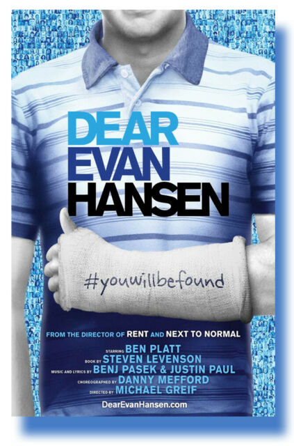
For my modern example of typography, I chose to analyze the poster for the Broadway musical, "Dear Evan Hansen". The most noticeable type of contrast within this poster is color as seen within the main type. This appeals to the viewer as the color gradient among each line of type follows that gradient shadow of the shirt the type is on. Additionally, structure is seen as with the differing typeface used for "#youwillbefound." Size is also used in this example to create a structural hierarchy. The eye first goes to the title then moves to the smaller text on the cast followed by the accreditations.
0 to Hero: Learning How to Write as a Designer for the College Student
When first approached with the question of what a graphic designer might write, I struggled to come up with a solid idea. As a Strategic Communications and Communication Design double major, I have always assumed that writing, no matter how trivial it may seem, is something that would be expected of me. I generated a few obvious answers such as photo captions as well as design mockups, but the following articles provided me with a deeper understanding of how writing can benefit me as a designer.
An oversight of mine in the free write, the "Importance of Writing for the Designer" article identified a crucial component of writing for designers, the creation of titles and meta tags for the purpose of search engine optimization. In the past, I have neglected to put a lot of thought into my titles, but in a professional design setting, I will have to carefully curate my title to better my chances of my design being found.
Another new idea I grasped from the second article, "Design + Writing = Power," was the notion of writing as a means to clear your mind. This spoke to me as I have found that I often feel more relaxed after I spend a lot of time writing. I typically accredited it to a sense of accomplishment, but I will now try implementing this as a way to relax when I find myself in high-stress situations.
Both articles also touched on the importance of writing frequently. One reason for this is that it is proven to strengthen communication skills. As a result of stronger communication skills, this will better my ability to communicate with my clients. Additionally, through the practice of writing often, I can begin to generate blog content which will allow me to become part of a community while building my online presence and showcasing my work. This way when I am ready to start my professional career, I will have started professional networking.